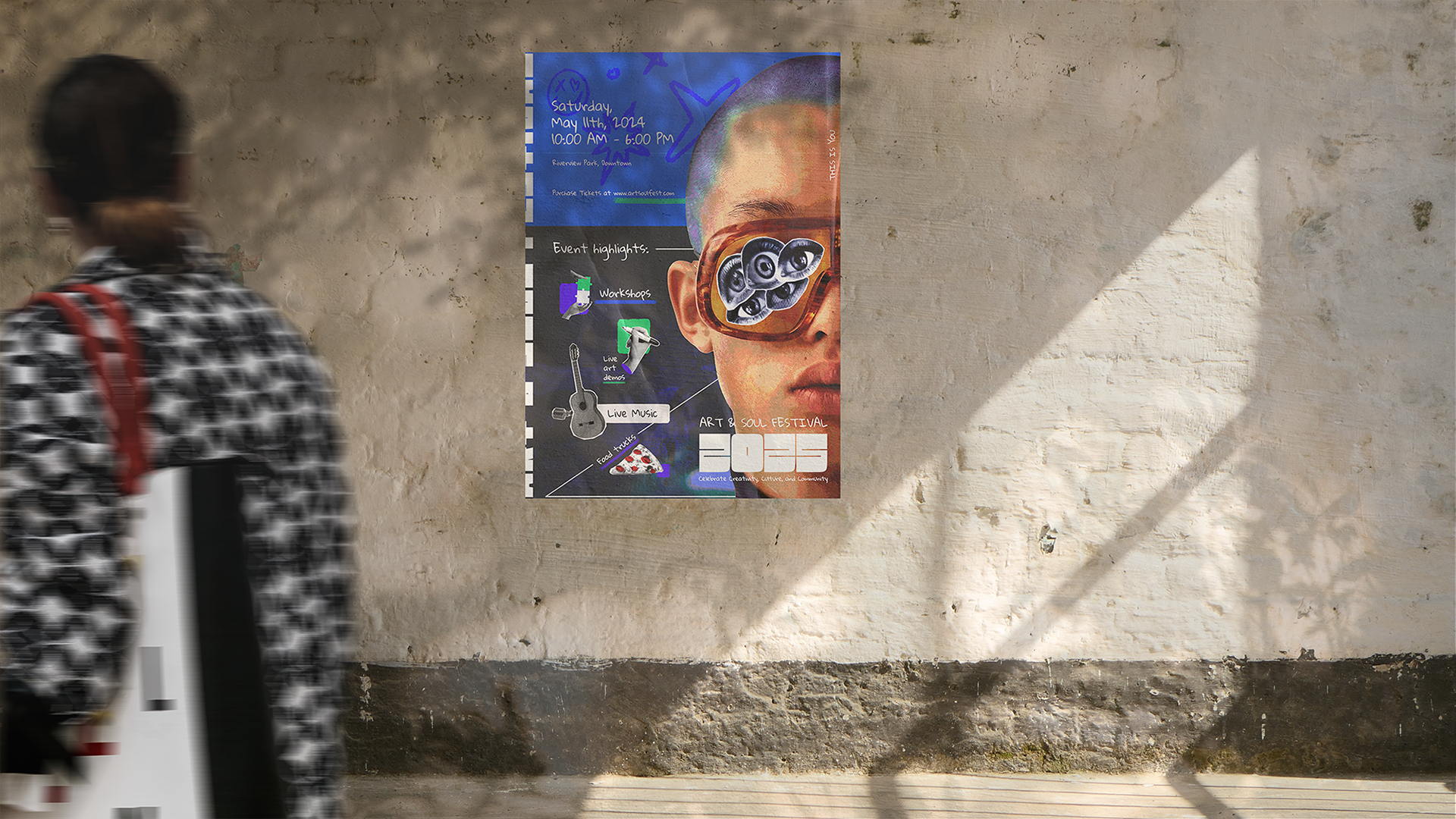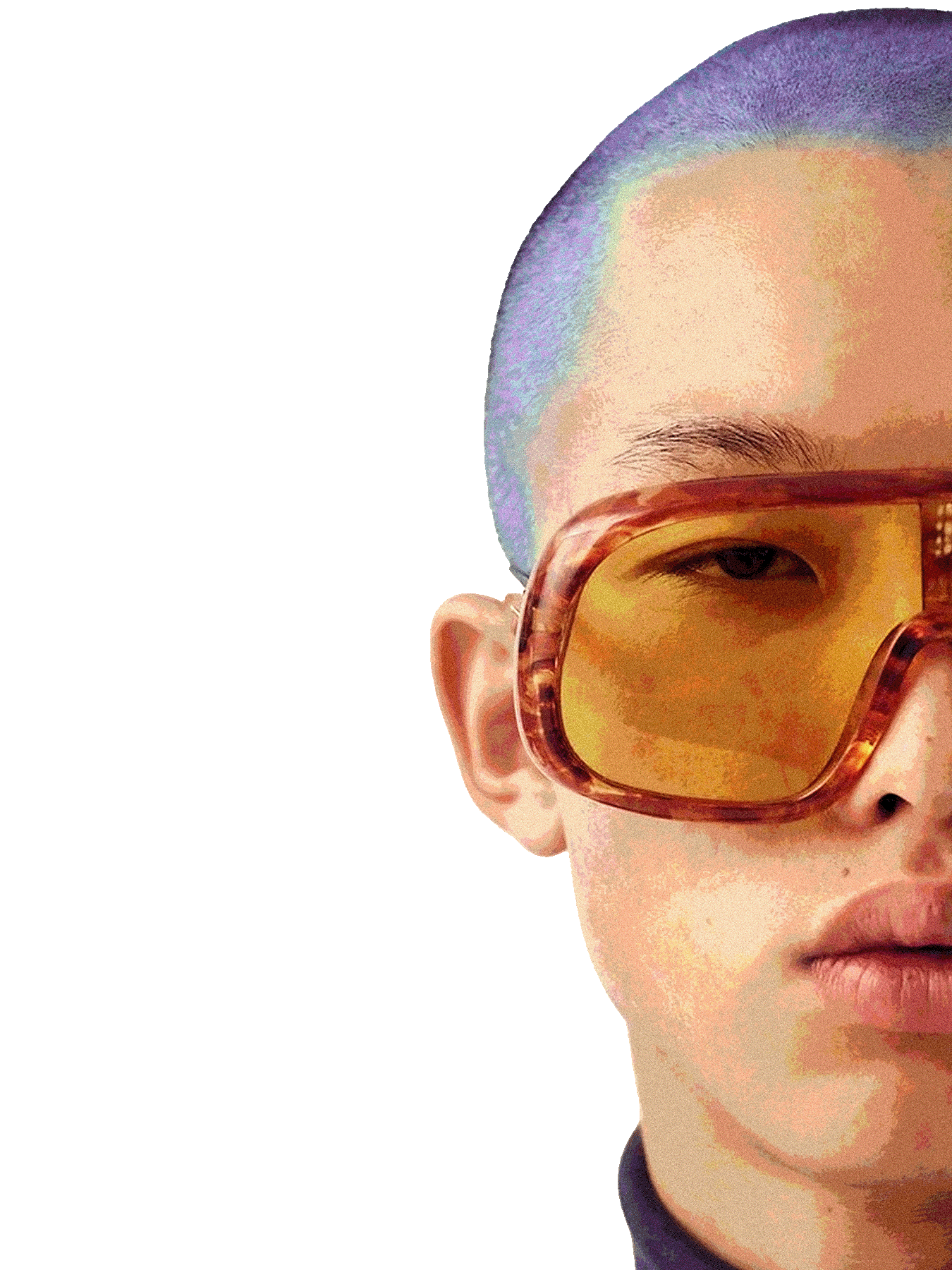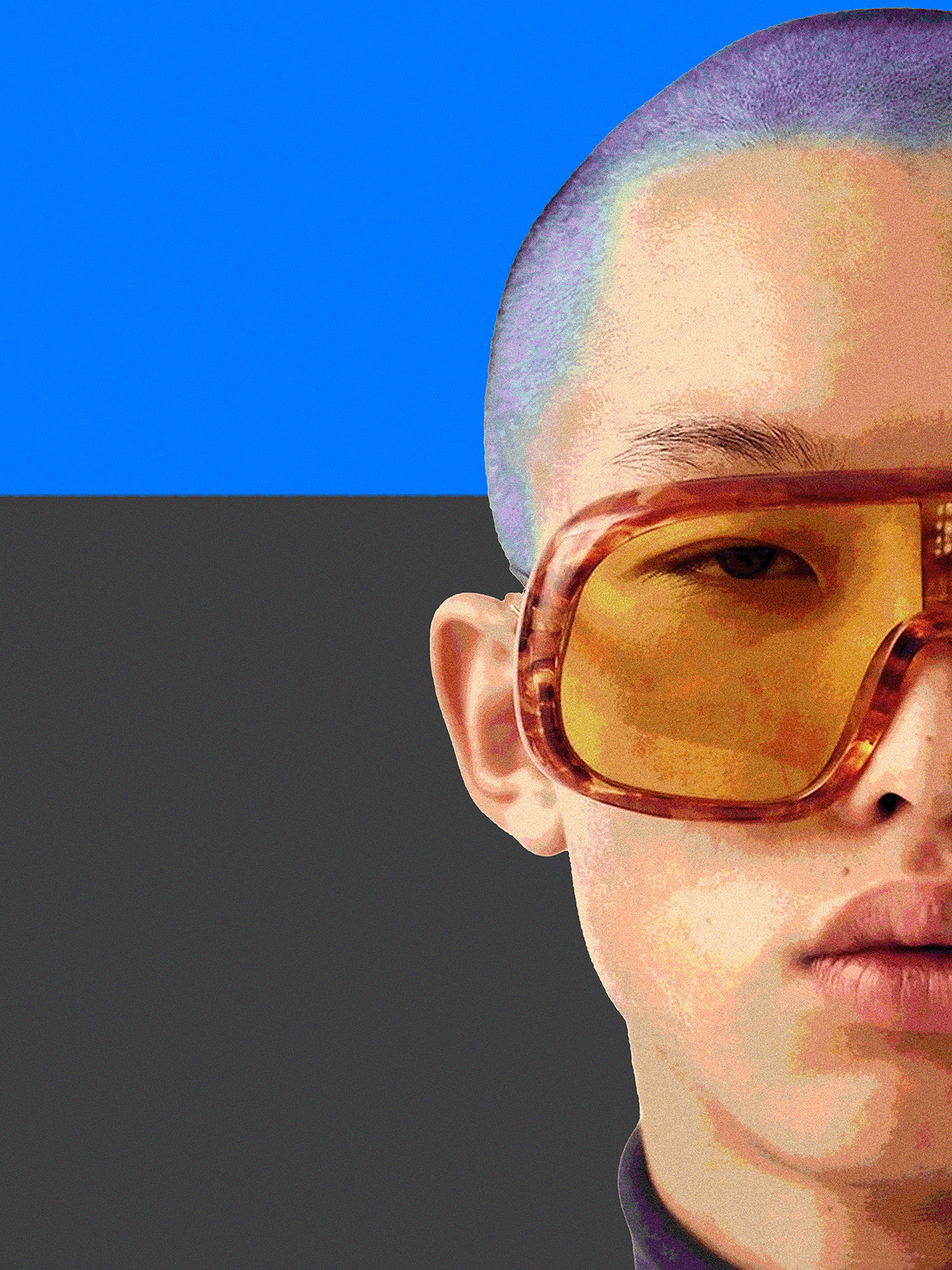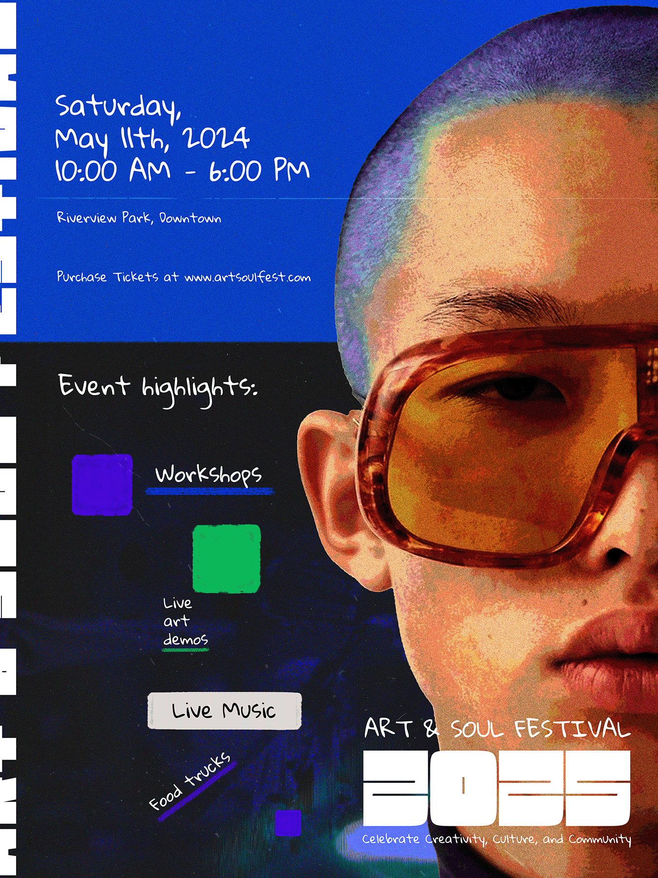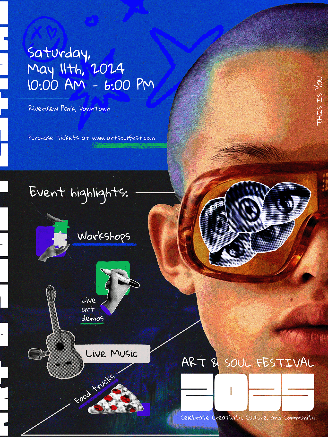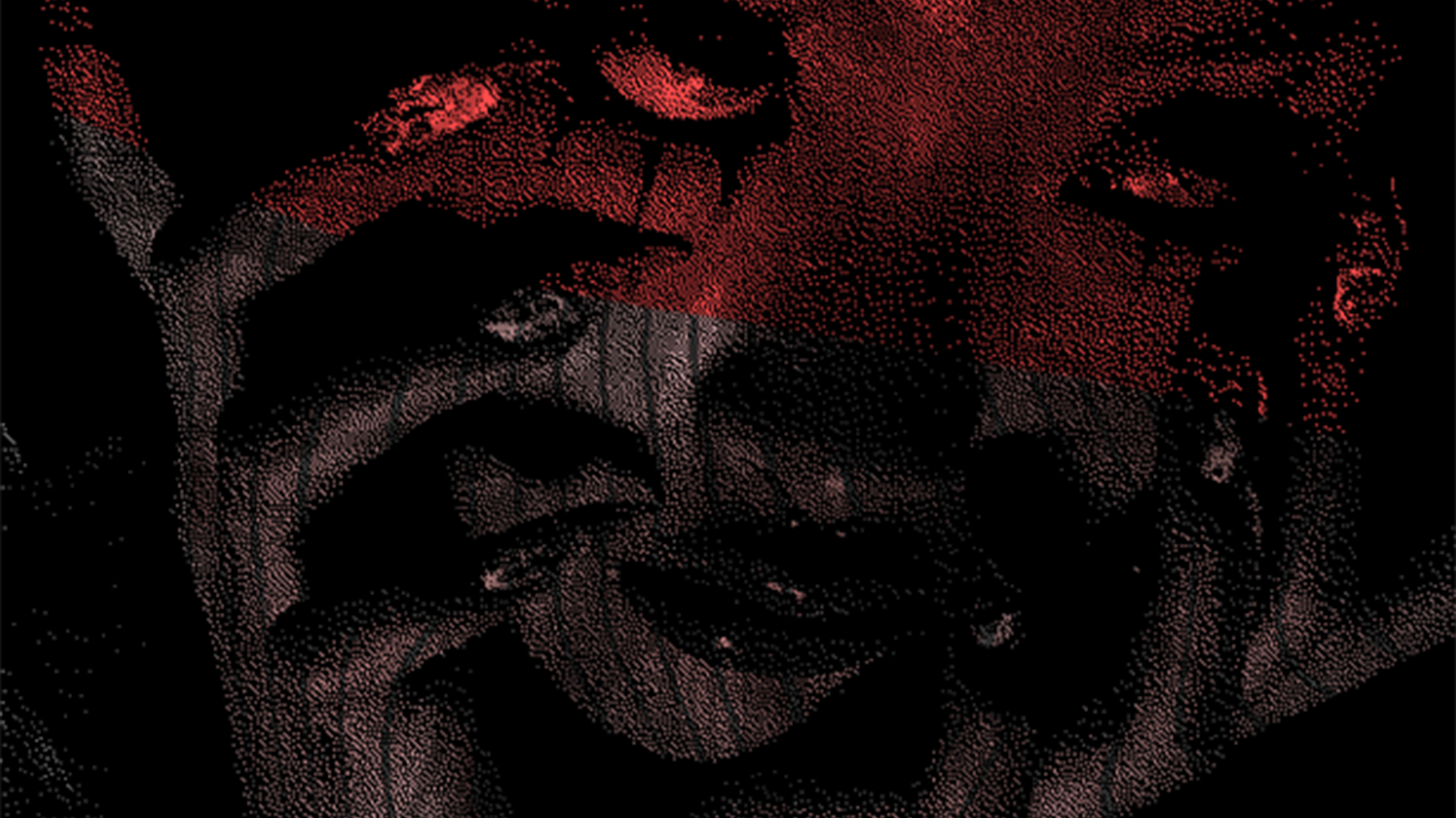
The goal was to create a playful and artistic design, using bold typography, dynamic shapes, and painterly/artistic textures & assets. A vibrant but energetic color palette was picked for the design to be colorful and inviting, while urging people to take action and check the festival out. The layout is balanced where the main asset takes as much space as the text around the design, with textures & other smaller assets accenting and supporting both. Sufficient white space was left to keep the important information readable and let them breathe.