ContentBacon is marketing company specialized in providing subscription service that give customers the resources (words, images, and sounds) to tell their unique stories. This project's objective is to advertise one of those subscriptions, the Spring Promo, and this campaign was created as a joint effort between our team of writers, editors, strategists, marketers, and me as the designer and creative branding expert. I took this opportunity to expand on the company's current look, adding more depth and dynamism to the designs, and more purposefully using colors. The goal was to create a simple professional look under the ContentBacon branding, while delivering the information needed. I've also explored more depth in these designs.
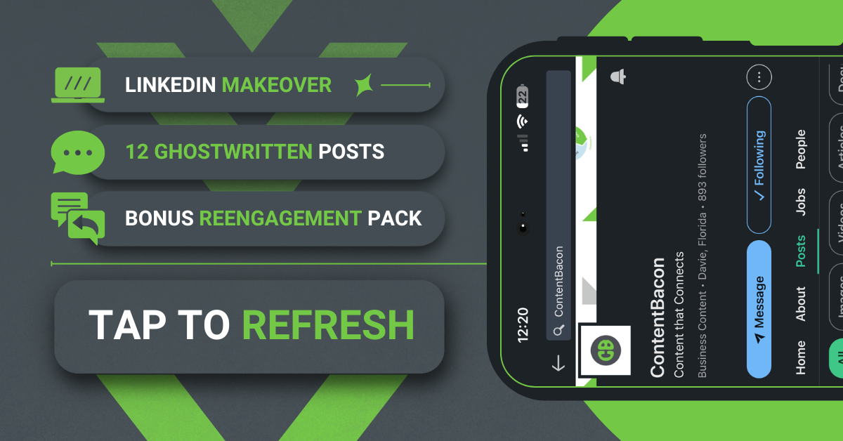
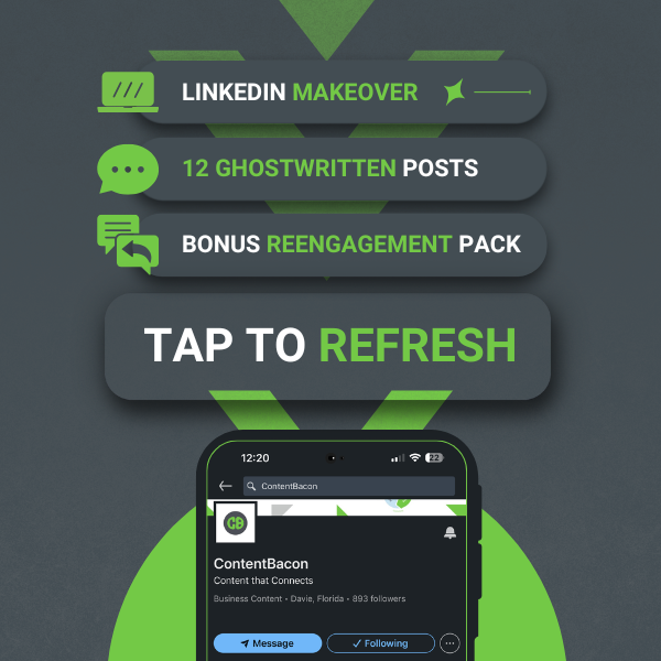
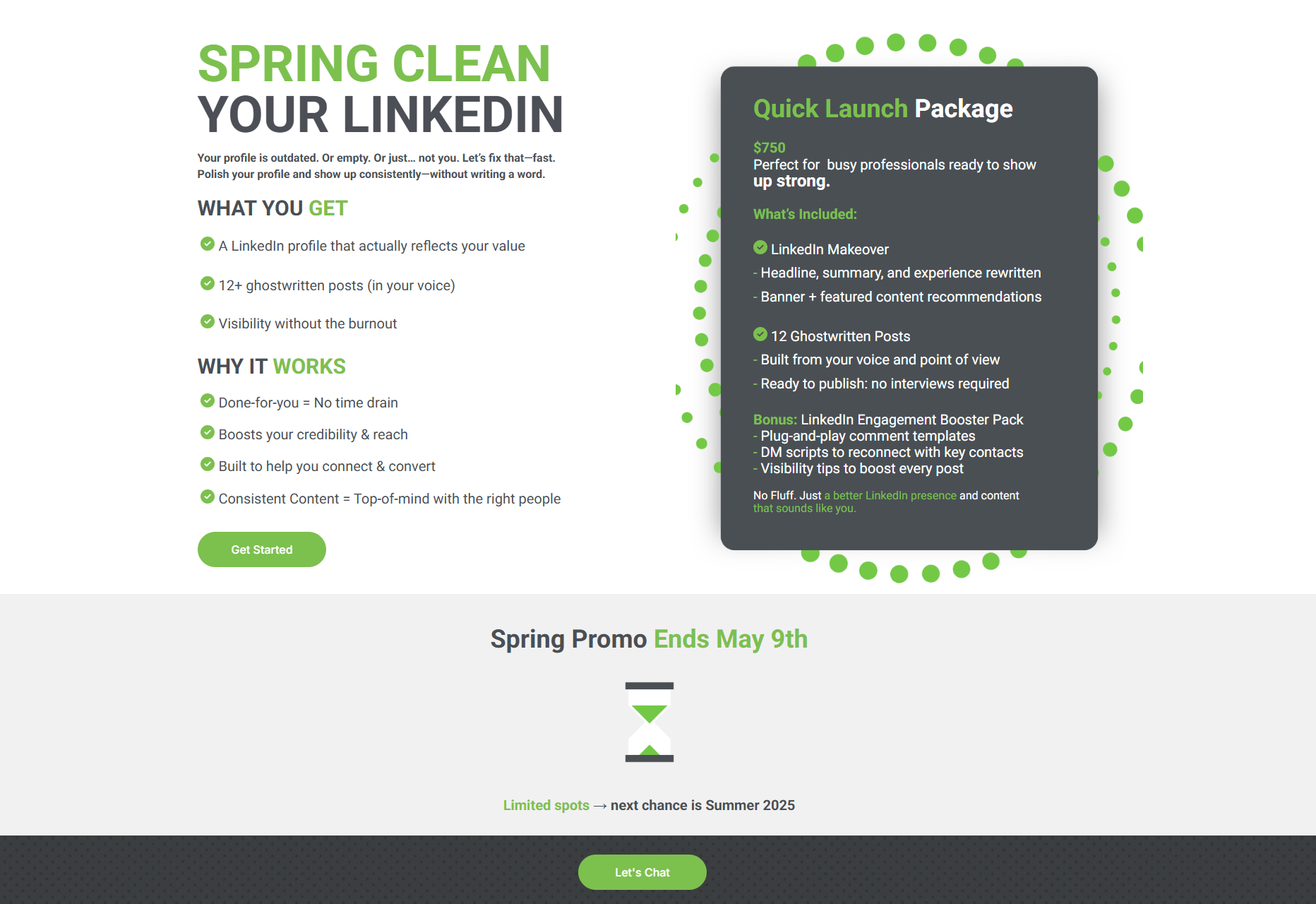
The list of deliverables include: Social Graphics for all platforms + Mock-ups to be used in design + Altered/edited/created assets for this campaign + Landing page design to accompany the graphics and convert into new customers.
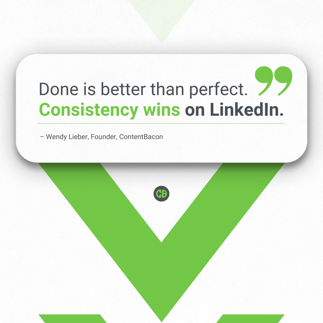
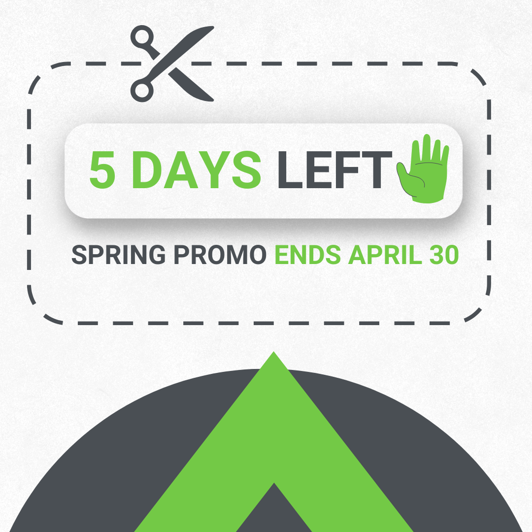
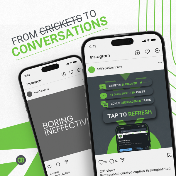
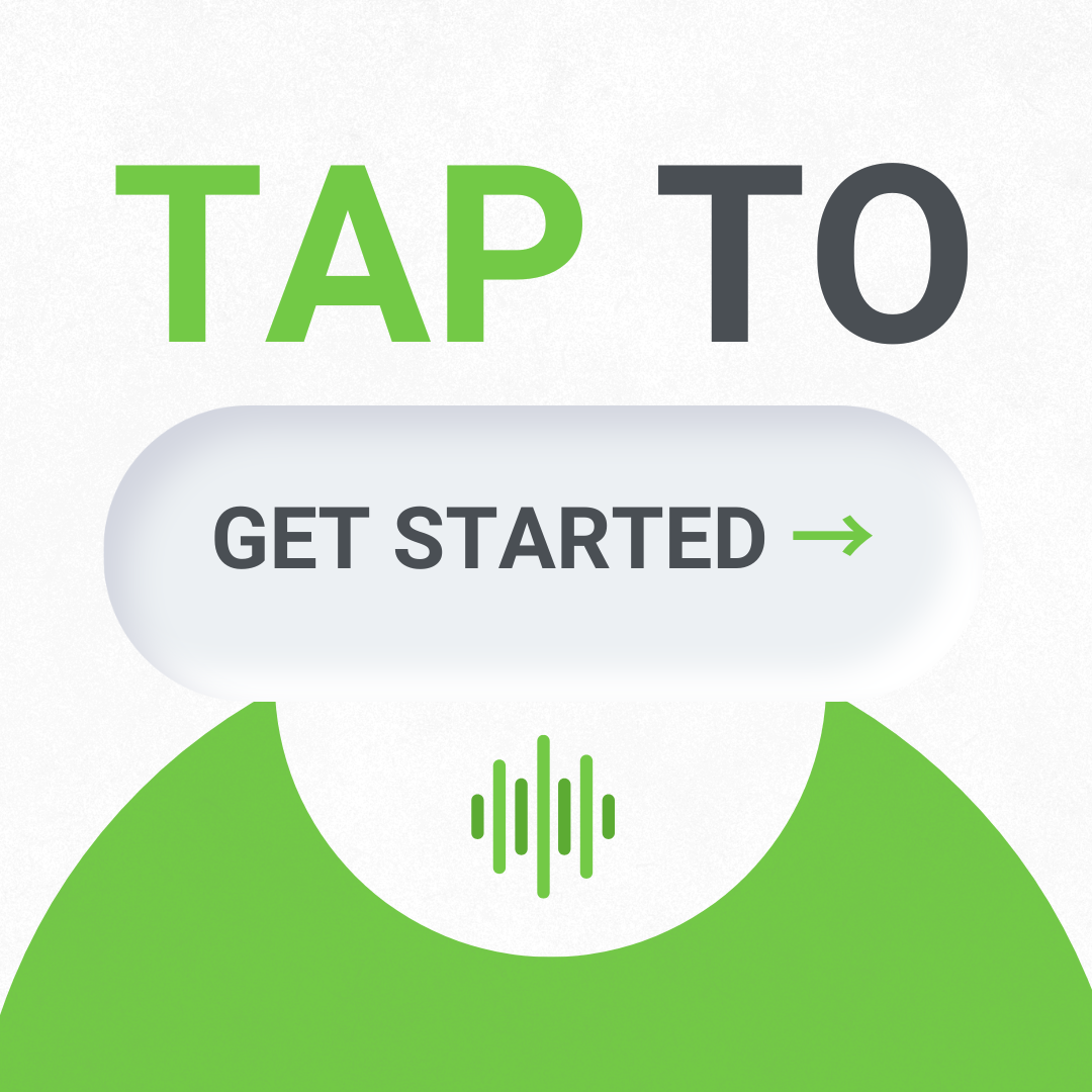
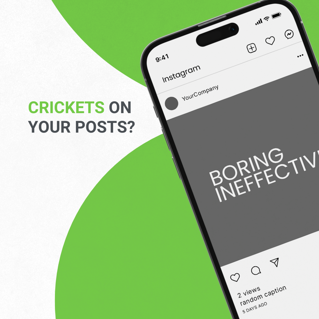
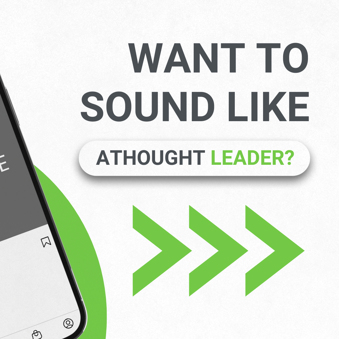
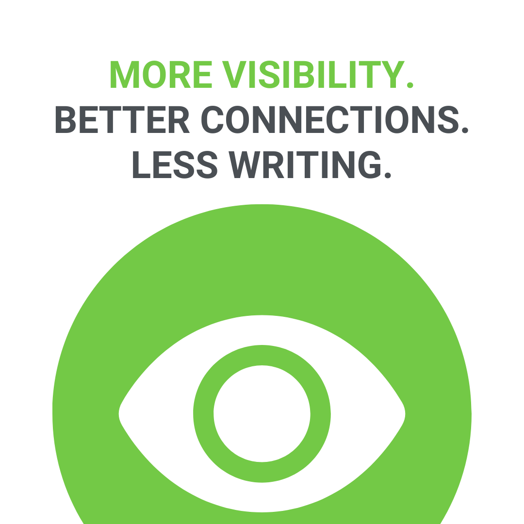
My design choices stemmed from the already existing CB brand (which I helped update), and the want to present more dynamic and engaging designs utilizing the CB arrow and simple shapes. CB is also all about connection, so I wanted at least some of the designs to feel and be connected either through idea or assets. I have used relatively rounded corners (15pts) to convey an approachable yet still professional and clean look, and to convey depth, shadows and embossing was used for CTA/Important graphic text. I have also opted to use some of the designs from this campaign to complete other designs in order to convey the practicality of the service, and to offer a real way for the customer to compare themselves.
This campaign resulted in the acquisition of multiple new customers.