


Allure:
Part of my everyday poster project. This is day 5.
Use of negative space emphasizes the focal point of the design. the typography & visual hierarchy further help drive the viewer's eyes towards the focal point. As this is a poster for a potion/perfume with a name like "Allure", purple felt like the correct decision as the main color for the design as it signifies mystery, magic, elegance, and femininity.
Content: art direction + creative direction + brand identity
The goal was to create a poster for this perfume, just in time for Halloween, that would appeal to women and people interested in the more witchy themed items, who would be this product's main consumer.
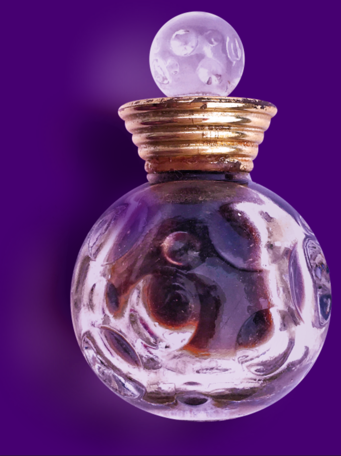
Purple was used as the main color as it exudes magic, allure, mystery, elegancy, and if used right femininity. The main design object in the design is a perfume bottle shaped like a witch's potion, and since purple signifies magic it's the perfect color for the background, enveloping the design with magic. White is used as a neutral color to balance with the purple, and continue giving off a sense of elegancy.
The main design object's color temperature was altered to match the color scheme and theme of the design project, giving the colors on the object, lights and darks, a purple highlight.
A noise layer is used in color dodge mode to give the design more texture, and lighten up the focal point & the design in genral. Another noise layer is used on top of that to lightly give the focal point more texture, and give the background a bit more depth.
Amoitar, a serif typeface, is used here to continue with the elegant magical theme of the design. Serif typefaces usually give off an elegant effect, and the certain stylization in the typeface lends to the magical yet elegant nature even more.